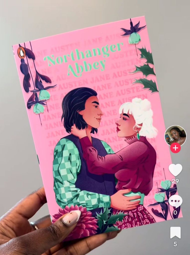
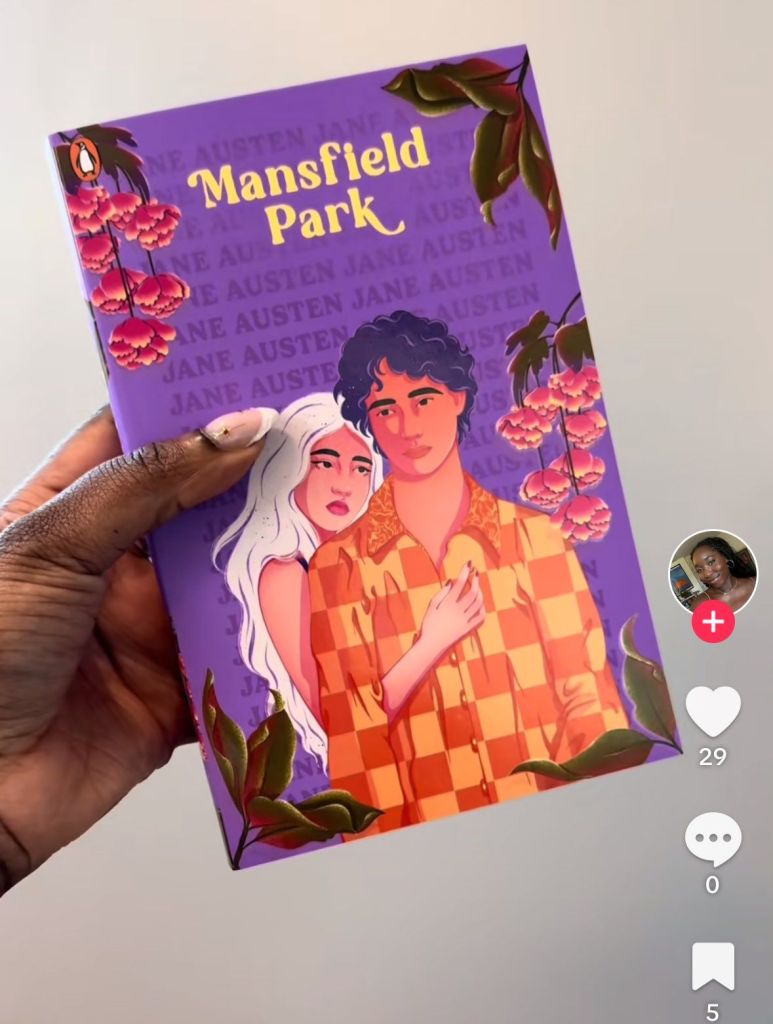
I almost threw up when I saw the cover art for a new edition of Jane Austen’s novels:

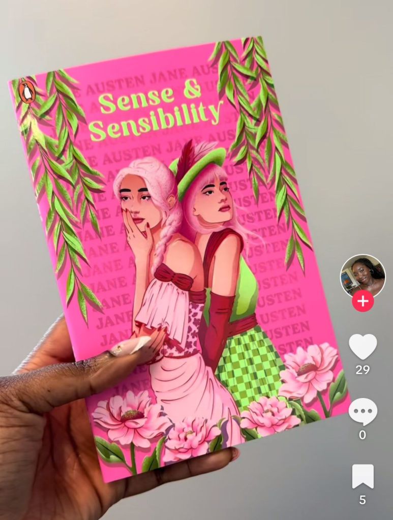
This is Penguin, by the way. And no, it’s not AI-generated. Only human beings can be this stupid and aggressively untalented.

13 responses to “Hideous Art Cover”

  1. methylethyl Avatar

    This is like the way they used to just take a random Frazetta painting and slap it on the front of any new SF release, without regard for whether it had anything to do with the subject of the book…

    Liked by 1 person

    1. methylethyl Avatar

      (except Frazetta was a better artist)

      Like

  2. Avi Avatar
    Avi

    Are these YA versions of the Austen novels? Abominable!

    Like

    1. Clarissa Avatar

      No, I think the texts are original, actually.

      Like

      1. methylethyl Avatar

        I’d’ve assumed they were the abridged-for-the-illiterate version.

        But in good and completely off topic news:

        https://x.com/BehizyTweets/status/1885482776889352371

        Liked by 1 person

        1. Clarissa Avatar

          That’s incredible! Such great news. So many things happening on all fronts.

          Like

  3. Ol Avatar
    Ol

    We used to make fun of hideous book covers, didn’t we? Those are terrible, especially the Mansfield Park one.

    Ol.

    Liked by 1 person

    1. Clarissa Avatar

      Northanger Abbey with the skanky bleached blonde is really out there, too. 😆😆

      Like

      1. methylethyl Avatar

        It looks like it’s trying to be a Game of Thrones/Austen crossover.

        Like

      2. cliff arroyo Avatar

        “skanky bleached blonde”

        Okay, now I want to rename all these books….

        Northskanker Abbey,

        Skanksfield Park,

        Skank and Skankability,

        Skanksuasion.

        ….ooof…. now I can breath again.

        Liked by 1 person

  4. cliff arroyo Avatar

    “new edition of Jane Austen’s novels”

    What I notice:

    Three of the four seem to play into race-play fantasies… white girl w/ brown boy (are we in for the BBC giving the books the Bridgerton treatment? or has that already happened?)

    The other has two girls…. and where is green-checker girl’s hand?

    The clothes are all aggressively ugly and all the covers suggest a color blind editor….

    My guess is they’re going for a manga vibe…. but… failing so, so hard.

    Liked by 1 person

  5. bluebird of bitterness Avatar

    Those are truly atrocious.

    Like

  6. random reader Avatar
    random reader

    It is said not to judge the book by its cover, but wow, this is bad. I would not want be caught carrying those around. If someone designed those to encourage people to read more, they are failing miserably. But perhaps they were going for an opposite outcome?

    Liked by 1 person

Leave a comment