The new Cracker Barrel logo:
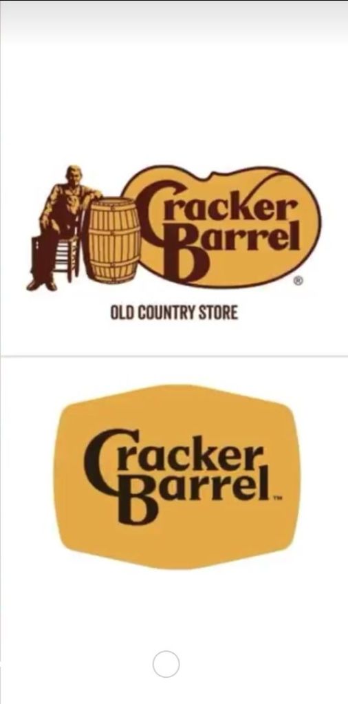
Those who have been to the place even once know that the minimalist aesthetic of the new logo is pretty much the exact opposite of what  Cracker Barrel is.

A rebrand should express something, instead of stupidly modeling the logo on five trillion other identical logos.

21 responses to “Another Talentless Rebrand”

  1.  Avatar
    Anonymous

    Stupidity, nothing but complete stupidity. No idea what their corporate section was thinking. Honestly, it feels like some new hire wanted to make his mark, and someone said let him have a chance.

    They really should have tested this out at a single out of the way location first to make sure it wouldn’t flop before rolling it out.

    I like Cracker Barrel. I’ve lots of good memories from eating there with my family. So it vexes me greatly for them to do this sort of moronic move.

    • – W

    Like

    1. Clarissa Avatar

      Her. It’s a woman. Sarah something. And it’s exactly as you say, she was a new hire trying to justify her salary.

      Like

  2. ShadowsCollide Avatar

    That’s a real shame, I love Cracker Barrel and they have the only fried chicken Mom will eat. Plus their store is amazing with all the decorations and old fashioned candy and vinyl records, the old store logo looked cool. Cracker Barrel is one of the few places outside of the South to find this sort of filling American food, because of them I developed a taste for turnip greens and chicken fried steak , and I’m a Yankee from New Jersey

    Liked by 1 person

    1. Clarissa Avatar

      The store is downright baroque. This new logo transmits the exact opposite. It’s so generic and boring. And that store is anything but.

      Like

  3. methylethyl Avatar

    They got rid of the white guy.

    Liked by 2 people

  4. Stringer Bell Avatar
    Stringer Bell

    An ongoing trend. What’s this obsession with making everything look the same? You see this in housing and restaurants too.

    Like

    1. Stringer Bell Avatar
      Stringer Bell

      On the burberry rebrand:

      While the purpose is to make the word more readable, more digitally compatible, Sans serif is considered too monotonous, lazy or even “rude”, which kills the personality that a luxury brand should have. It is clear that Lee’s intention was to redefine the concept of tradition, emphasizing the inheritance and the essence of England. This new logo is declared by the brand itself as “archive-inspired”.

      Today Britain is much more cosmopolitan, there is a little bit more of an edge to it, a different spirit… Daniel is thinking hard about who are the icons of Britain today, he’s got some really exciting ideas. I promise you, you’re going to see an incredibly strong brand image.” said the brand’s CEO Jonathan Akeroyd.

      Globalism!

      Like

      1. Clarissa Avatar

        It’s all one, uniform, indistinguishable glop of a global company.

        Liked by 1 person

    2. cliff arroyo Avatar

      “obsession with making everything look the same?”

      Most people call it ‘refinement culture’ also behind the HGTV “aesthetic”.

      Like

      1. methylethyl Avatar

        After poring over hundreds of real estate listings… I hate that aesthetic.

        Why? Why did they have to paint the entire town gray?

        Like

        1.  Avatar
          Anonymous

          Some people really didn’t like that in my town. I have seen houses painted blue, one where a single side of the house was painted pastel pink, and another whose owner liked Halloween a bit too much. The whole house was painted black, and the window shutters were painted orange.

          Frankly I approve. Except of the pastel pink wall. That could have been done better. It needed glow in the dark stars or glitter.

          • – W

          Liked by 1 person

          1. methylethyl Avatar

            My old neighbors, when they moved in, waited a season to repaint. They went round the south side of the house, where the local biota turns the siding green. Most people pressure wash this once a year or so, or just let the house look dingy. She color-matched the shade of green on that side of the house, painted the entire house that color, and then picked nice coordinating shades for the trim. It looks fantastic. It’s quite a nice shade of green.

            Like

        2. cliff arroyo Avatar

          “Why did they have to paint the entire town gray?”

          One possible explanation I saw (paul skallas iirc) was that the HGTV all gray all the time appeals to both men and women.

          Women – want a space that looks clean (or can quickly be made to look clean)

          Men – want uncluttered (except by their own crap) spaces.

          It inspires neither but meets minimal requirements of both.

          Also, the idea is that it’s not about creating spaces to live in but to (re)sell.

          Whatever it is I hate it. It’s okay for a hotel but not for a living space.

          Liked by 1 person

          1. methylethyl Avatar

            Given the other things I’ve seen in these flip renos… I think the main idea is to take an actual house, and turn it into a blank canvas, to maximize the spread of possible customers. It’s heartbreaking to watch: ripping out a still-pristine 50s tiled bathroom because it’s pink, or jade, or some other too-specific color, and replacing it with chrome fittings and dove gray walls. It’s a downgrade: that half-wall tile was more durable, prettier, and also easier to clean. The ceramic TP holder had already lasted seventy years, and had maybe another thirty to go. But no, that’s dated. As if your current soulless gray reno wasn’t dated: worse, it’s going to look like crap in two years.

            That still doesn’t compare to what they do to landscaping. These savages *pay extra* to rip out mature, producing fruit trees, heirloom rose bushes, etc. all in the pursuit of a low-maintenance, absolutely characterless blank canvas. Like the goal is to make a 60yo house look like nobody’s ever lived there before. Blank green lawn. It’s deeply offensive.

            Like

            1. cliff arroyo Avatar

              “Don”the main idea is to take an actual house, and turn it into a blank canvas”

              God I hate those shows worse than the devil… pure evil. I understand changing things that are wrecked but mocking and destroying perfectly good and useful things is awful.

              Liked by 1 person

              1. methylethyl Avatar

                “Oh! I know! Let’s rip out this perfectly fine quarter-acre kitchen, and replace it with a different but functionally identical quarter-acre kitchen!”

                Like

            2. Clarissa Avatar

              Anybody who removes a live, mature tree to “landscape” should be drawn and quartered. I despise people who destroy trees for such ridiculous reasons.

              Liked by 1 person

              1. methylethyl Avatar

                All subdivisions start out as clearcut. Trees are what make it look not-brand-new (and naked and pathetic)… therefore they must go.

                Like

    3. stille Avatar
      stille

      Readability on phone screens

      Like

      1. Clarissa Avatar

        I’ve posted this on my phone. Both are identically visible.

        We had the same type of rebrand at my university. Wasted tons of money we don’t have on it. So dumb.

        Like

        1. cliff arroyo Avatar

          “Both are identically visible”

          I’m sure the words Cracker Barrel are equally visible but the old guy in the old brand will be blurred (along with the words ‘old country store’). Especially when it’s not taking up a lot of the screen.

          If you know what it is, you’ll make more sense of them but if not… then not.

          Phone branding is bare and simple as possible. I hate it.

          Like

Leave a comment

A conservative literary critic and college professor