OK, folks, I have until tomorrow to select an image for my book’s cover. Here are some images that I’m considering, and I need help choosing. Think crisis literature, liquid capital, fluidity, etc. Of course, you have to imagine the photoswithout the “Istock” logo on them. Please vote in the comments.
Image 1:
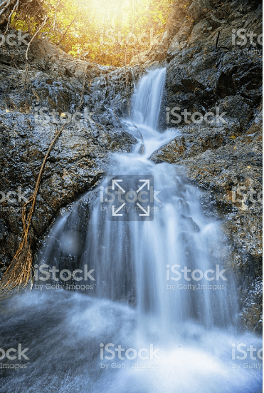
Image 2:

Image 3:

Image 4:

Image 5:

Image 6:
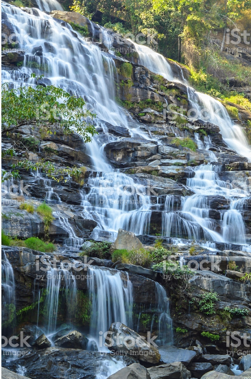
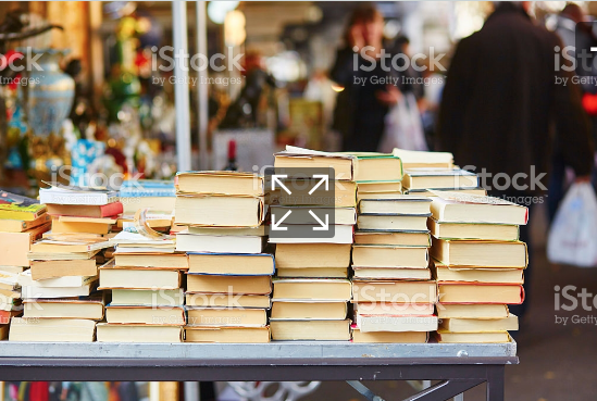
Image 7:
If they all stink, I can keep looking.

Do you have to use an istock photo? For my book (collection not monograph), I actually selected an image from a museum that was noteworthy and that I discussed in the intro. The press took care of all permissions and everything. I just had to tell them the illustrator, the title, and send them a link. Do you discuss any images at all? Or is there maybe an artist that produces work that can be provocative in this context?
LikeLike
I only found out about this today and have to make a decision by 5 pm tomorrow. So it’s got to be one of these images or none at all. They moved the date of publication to to 3 months earlier and now everything has to be done very fast.
LikeLike
In order of preference: 6, 1, then 4.
But it may be worth hiring a designer to come up with a unique cover page. It’s not too expensive.
LikeLike
They have designers who will integrate the image into the cover and do the fonts, etc. I have to select the image, though.
LikeLike
Any image of water/streams is going to be too on the nose for a book about ‘fluidity’. I’d avoid that.
Honestly, I don’t like any of these. A thought: how about one of these global maps of people/cargo flows? Talk about capital flight!
LikeLike
Yeah, I thought the waterfalls might be a bit too direct. How about the sand clock? Like in, time is running out, idiots!
LikeLike
I definitely like the sand clock idea much more.
LikeLike
I also happen to love sand clocks to the point where I used to steal them as a child. Because I couldn’t stand the idea of them all not belonging to me. 🙂
LikeLike
I like this: the zoomed-in shot gives off a sense of urgency.
LikeLike
None of the them. What’s the book title?
#1, #2, #6 look like they belong on the front of a nature guide, #3 looks like a finance/math textbook, #4  look like a business book where they talk about time being money, and #7 is the cover of “The Bookseller’s Wife” or the beginning of a language software program where you go to buy books. I like Stringer’s suggestion.
Honestly, a melting globe with the axis looking like a dollar sign would look cool. The globe is being transformed into a more liquid state like ice goes to water.
LikeLike
“#7 is the cover of “The Bookseller’s Wife” or the beginning of a language software program where you go to buy books”
The tile is: Literature of Crisis: Spain’s Engagement with Liquid Capital.
LikeLike
Something like this:
Embed from Getty Images
LikeLike
It doesn’t show.
LikeLike
No idea how to embed:
link to melting globe
LikeLike
I don’t want people to think I will be talking about the environment, though. I had to cut out the part about the environment, actually.
LikeLike
Yep, the waterfalls are way too idyllic for this. The hourglass idea is better but I don’t like those particular hourglasses – they’re rather unimpressive, visually, and don’t really suggest urgency. Out of the original images, I’d pick the one with the books
LikeLike
Yes, it’s like, behold the beauty of liquid capital. And then the book says the opposite.
LikeLike
Beautiful, yes, but they’re beautiful in a rather sleepy manner. Sitting by watching the waterfalls is precisely the sort of thing liquid capital leaves no time for.
LikeLike
GOOD point. Plus, it’s destructive to nature.
LikeLike
One hourglass I rather like :
[img src=”http://media.istockphoto.com/photos/hourglass-picture-id115922825″]http://www.istockphoto.com/photo/hourglass-gm115922825-2533084[/img]
LikeLike
And I can’t get embedding to work so here’s another one on the theme of time running out http://www.istockphoto.com/photo/time-is-running-out-gm529052572-93188021
LikeLike
Oh wow, this is a good one.
LikeLike
I like the images of the world made up of currency.
Two World Maps Created with a Country’s Own Currency Maybe have that kind of image zoomed in on Spain with a water effect over it?
LikeLike
How about something like this: still a stream (or waterfall), but instead of water, it’s dollar bills that are flowing down the stream/waterfall? Google “dollar bills flowing” there are all sorts of images with money coming out of pipes etc., flowing, flying, etc.
I personally think a nature picture is better than a money picture because it’s not that obvious. For instance, Jackson’s book Electrodynamics, which every grad student in physics suffered through at some point, has a cover that has nothing to do with electrodynamics and is a mountain peak… Because electrodynamics is freakin’ hard, like climbing Mt Everest. Every grad student must have thought about the choice of the cover, which is an added benefit in never forgetting the book.
LikeLike
That’s an interesting idea. To do something completely unrelated to make people stop and think. Plus, even academics stop to leaf through a book at an exhibit because of the way the cover looks.
LikeLike
What’s the point you want the cover to convey to the reader?
LikeLike
They stink. What about something like one of these..?
http://www.bbc.com/news/world-europe-19768354
LikeLike
I quite like 3
LikeLike
More…
https://media.npr.org/assets/img/2013/02/15/8154776403_08455ea987_c-854fc877d068886f9580ce5bf2c4fee652428004.jpg?s=6
LikeLike
It would be great if it were something Spain-specific but I’m not seeing anything like that. I’ll keep looking.
LikeLike
cliched but…
LikeLike
LikeLike
LikeLike
If you wanted to put buildings on the cover, you could put a photo of a European central bank.
LikeLike
frayed flag underwater….
https://encrypted-tbn0.gstatic.com/images?q=tbn:ANd9GcSyBc_QnGuhGRBgobeK0AXuvwKErSNPKdCc7I6U7Pp5AZIfYIm9Yw
kind of like this…
https://encrypted-tbn0.gstatic.com/images?q=tbn:ANd9GcRmqaw-QnitKbcnk7cFYYVf2GhX3KHWa5cVW2p3G2P6rdy1WAvQ
LikeLike
Spanish paintings:
LikeLike
It has to be from istock
LikeLike
Image 03, but only if the arrow went in the opposite direction.
LikeLike
I liked this one
http://www.istockphoto.com/il/photo/sinking-euro-ship-with-a-torn-flag-gm494499100-77476741
LikeLike
Now it will appear here
http://media.istockphoto.com/photos/sinking-euro-ship-with-a-torn-flag-picture-id494499100?s=2048×2048
http://media.istockphoto.com/photos/eurozone-financial-crisis-picture-id174929050
This is probably too boring:
http://www.istockphoto.com/il/vector/crisis-concept-gm685920700-125963647
LikeLike
Waterfall images might work better if you include some fish struggling upstream to their inevitable deaths.
https://www.google.com/search?q=salmon+swimming+upstream&tbm=isch

https://polldaddy.com/js/rating/rating.js
LikeLike
This is funny. 😋 I’m liking this thread.
LikeLike
This would be a great choice! You want an eye-catching image, and there’s no way anyone’s passing up thumbing through a book with this bear on it!
LikeLike
Istock image of a planet in an hourglass melting
LikeLike